
Packaging creation for Shell Car Care
A completely new and extremely different way to present a large range of diverse products.
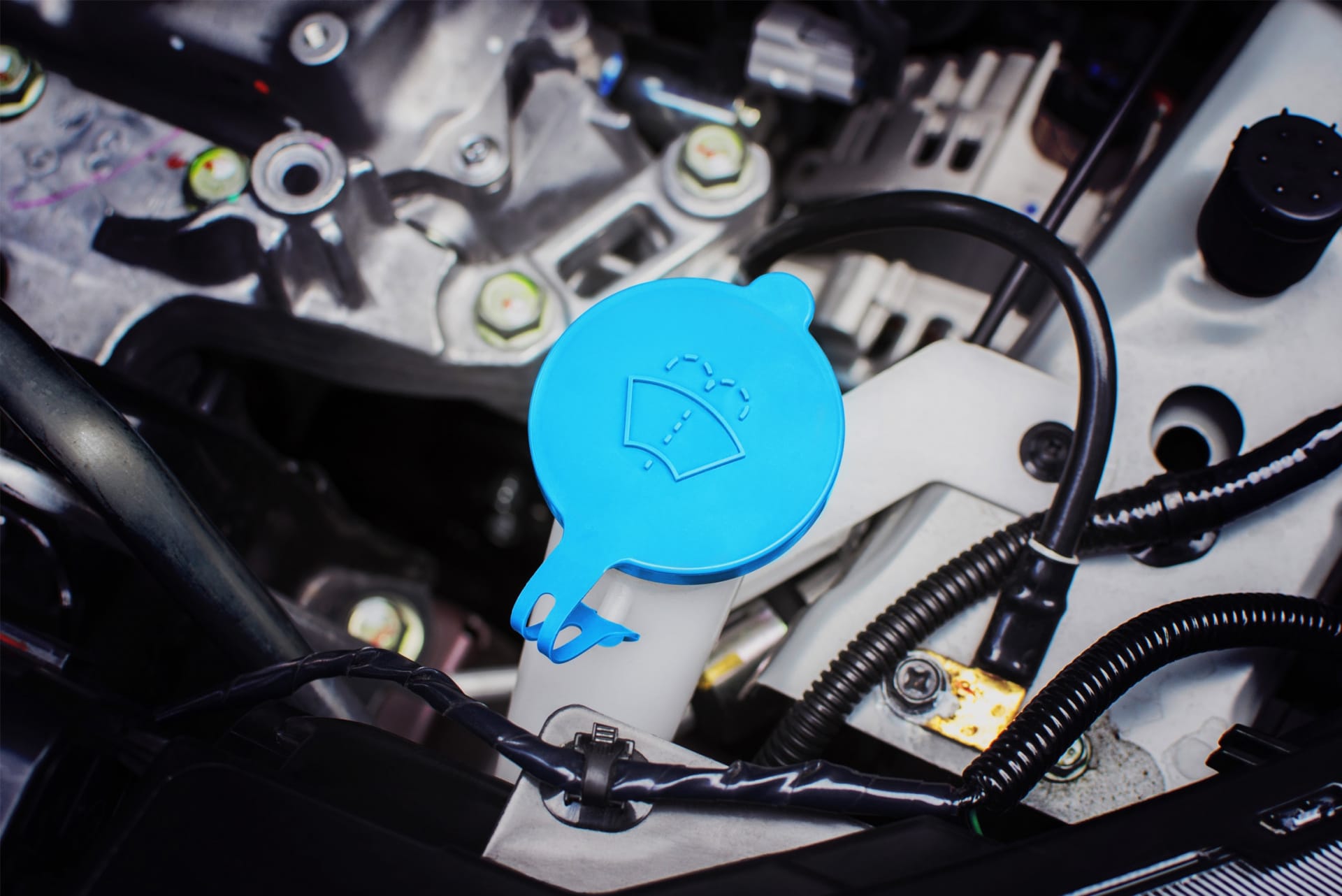
Shell Car Care needed to bring consistency and integrity to an ever growing line of over 120 product types across two very different continents. The packs had to be radically updated for improved shelf presence and instantly recognisable to consumers.
“Bold colours, simple, easy to understand graphics and a solution that helps to take the portfolio to the next level. We are absolutely delighted with the results."
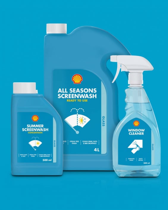
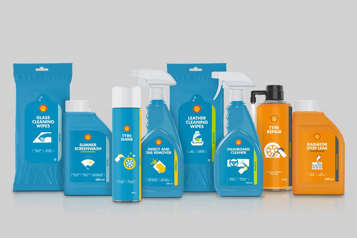
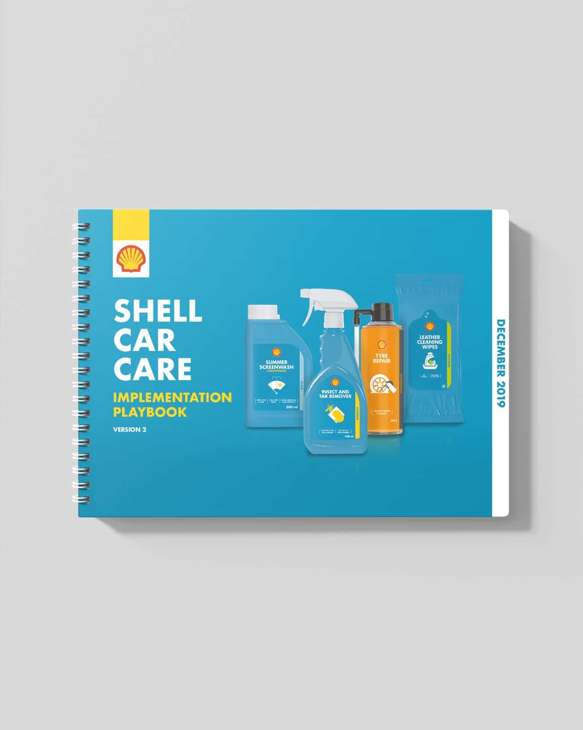
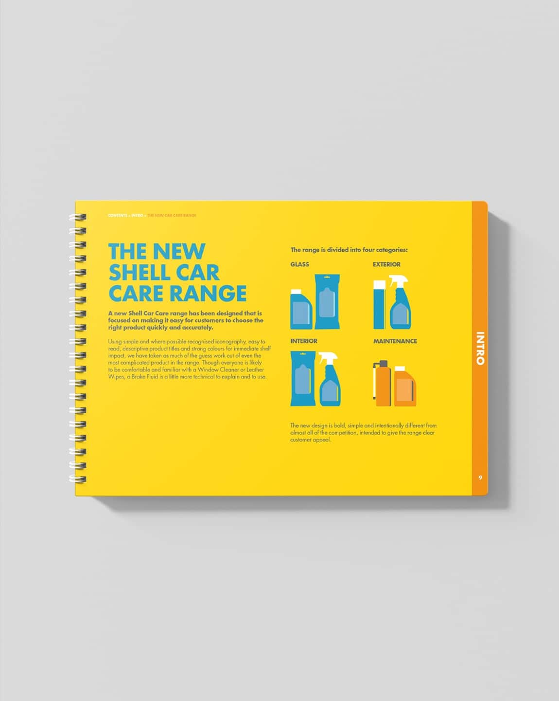
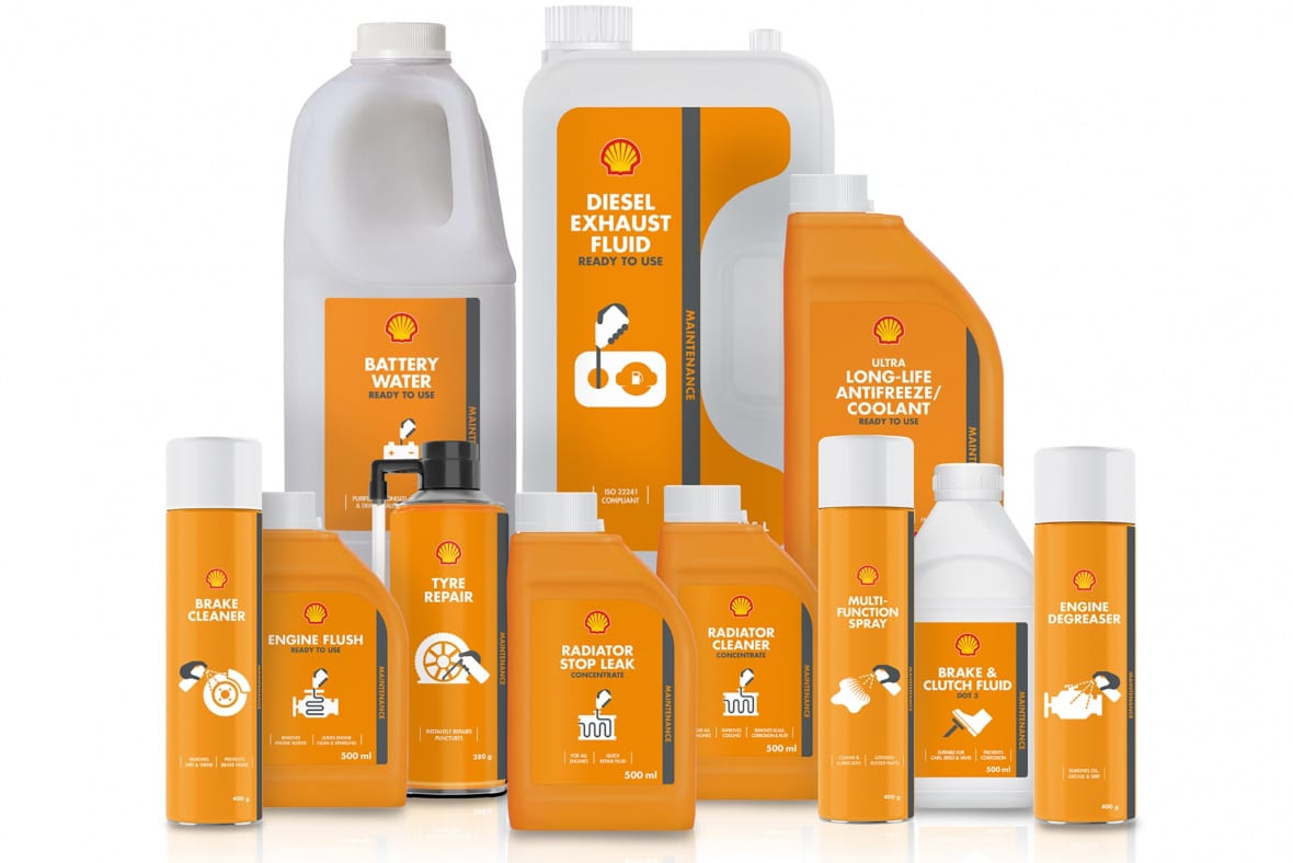

We took inspiration from the warning lights of a car instrument panel which glow when you need to take care of your car. Using these simple icons made sense as they help the customer instantly relate to them and their immediate need. Recommending the coloured packs made sure that anyone entering the store would be faced with a wall of colour which owned the retail space amongst the competition.
An ambitious new look and a brave way to present a large range of diverse products has recently gone on sale in the Far East and Europe. We await to hear the initial response from consumers, particularly given CV19, but the signs from both markets are very good – we’ll keep you posted.